Valier
Visual languages for brand repositioning
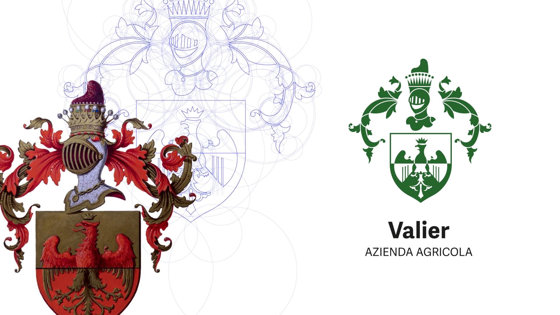
We redesign the brand logo, which roots back to heraldry, and we created a complex ecosystem of graphic elements to achieve the repositioning of the company and its products.
The collaboration between Valier and Ida Studio began in 2014 to accompany the brand towards the creation of a communication system capable of satisfying the commercial needs of a growing company, in b2b as well as b2c.
We put the product at the centre of the communication narratives, from web interfaces to print campaigns, from billboards to packaging, brochures and company profile. Valier’s entire brand project started from an ambitious work of updating the family coat of arms.
The aim is to unite the tradition that comes from a century-old history spanning no less than 5 generations with the innovative and constantly evolving soul of the brand, to build more contemporary languages.
Valier’s flagship product, Lara Walnut, has been the protagonist of many communication actions in recent years, starting with the design of an entire dedicated website, based on an original icon system.

On the 30th anniversary of the Valier Lara Walnut’s first launch, we designed a nationwide brand awareness campaign declined on various media, including press campaigns, billboards, social content, packaging and more.
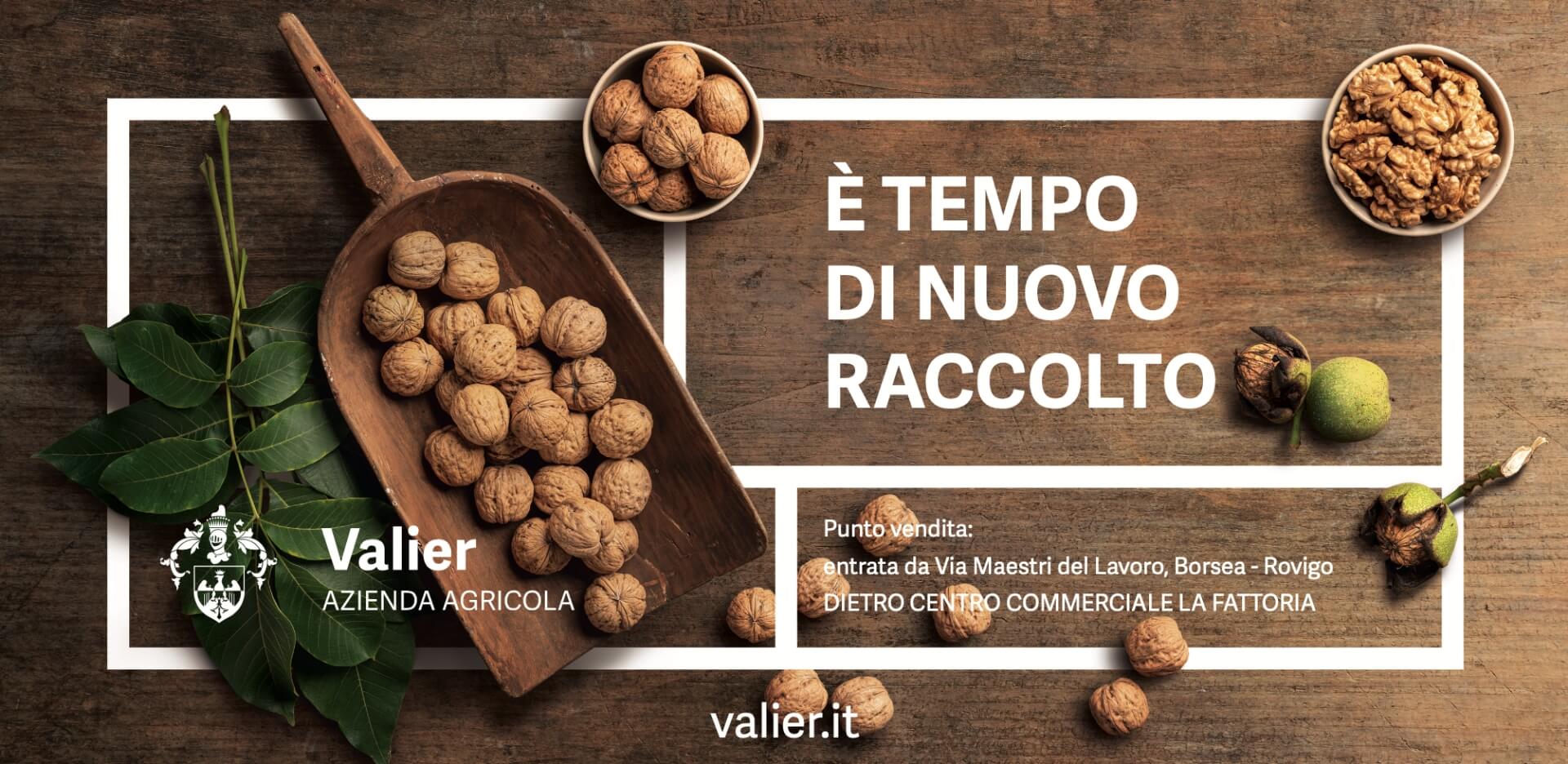
Valier’s walnuts were also featured in the 2021 poster campaigns, which appeared at various times during the year to promote the company store.
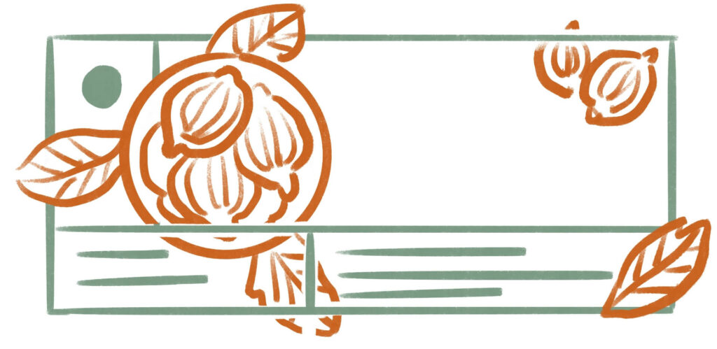
The billboard was the result of a complex design process, starting with the creation of the sketch and ending with the photos, including set design, props research, art direction and more.
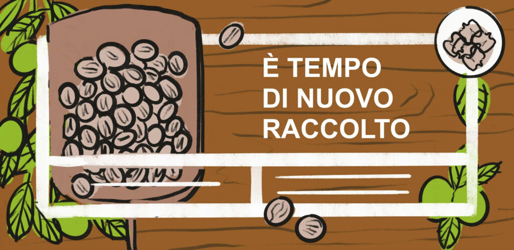
Valier’s latest work is the redesign of the packaging of all the company’s products. We developed a concept based on the idea of a “walk in the woods”, conveying a very precise natural sensation that can be easily traced back to the brand.
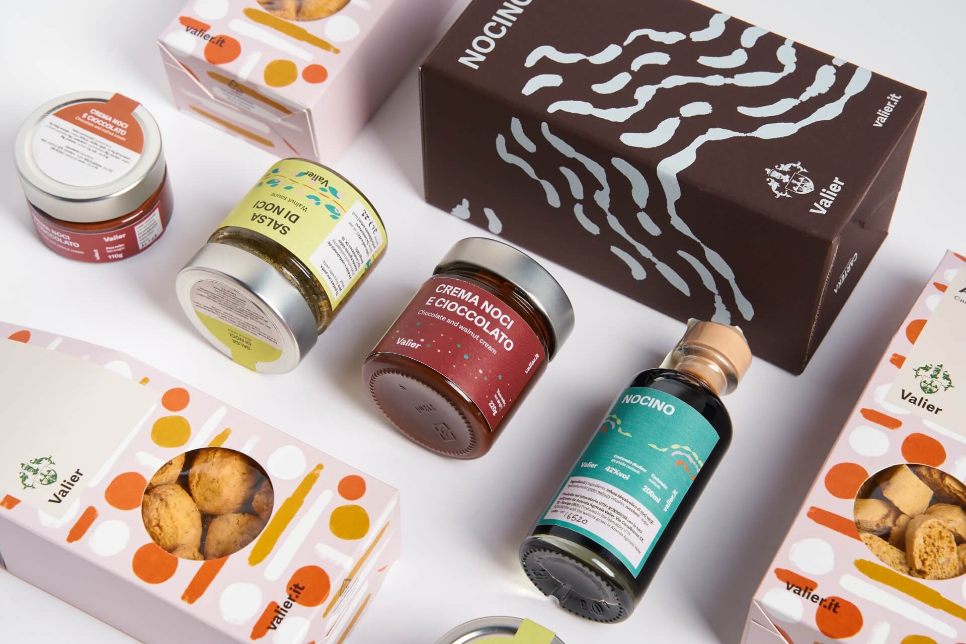
All packaging, therefore, refers to the idea of a walk in the walnut grove to evoke the feeling of being immersed in nature.
Starting from this concept, the packaging of all product lines was designed using a precise color palette and a dedicated illustration.
The collaboration with Valier shows how we worked together with the client, to make the brand image evolve in line with its the company’s growth, adopting current languages that manage to keep the brand true to its positioning, values and essence.

